Frank Cho Women book 2 review: boobies!
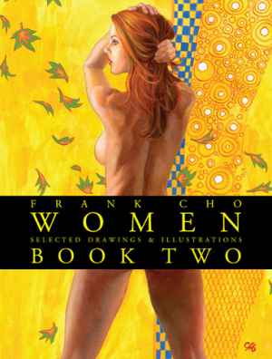 Frank Cho’s star has been on the rise for a while now. His creator owned strip Liberty Meadows is no longer where most people know him from given all the mainstream books he has worked on lately. Cho is known these days as a Marvel artist and has just started writing and drawing The Savage Wolverine. Cho has gained fame in recent years for covers emphasizing his ‘good girl’ art.
The second volume of Women is not as big or as high-quality as the first volume. The first was a cloth bound cover with a dust jacket that really gave the it an ‘art book’ feel. This book just feels like another collection of pin-ups. Glossy color covers on this sort of book look cheap and juvenile to me. My gripe about its packaging notwithstanding, this is a very good looking book inside. The first thing that you notice as you flip through this volume (the first scan of an art book is a cursory one for me, more detailed viewing on the second trip) is that it is a bit racier than volume one. There is a fine line between ‘good girl’ art and erotica and Cho walks it well without stepping over.
There is a fair bit of nudity of the boobie variety, but nothing that pushes the flavor of this book too far into the erotica area. The clear hallmark of all ‘good girl’ artists and their work that separates them from erotic art, is the humor. Cho’s art in the past and in this book particularly, is very light and fun. Brandy from Liberty Meadows is well represented here and her selections all include some of the odd cast of animal characters that populate her world. A real positive in this volume over the first is the lack of reliance on mainstream super hero covers. The first volume had too many and cheapened it at times. In volume two the content of the art never works against the feel of the book or its intent.
A lot of attention is paid to the early stages of many of the works displayed such as preliminary drawings and uncolored versions of the final work. Consisting entirely of covers and pin-ups, Women volume 2 is a strong visual book with very few fluff or filler pieces. The differences between the line art and the final colored piece are well displayed here and show off the advantages and disadvantages of both effectively. There are selections you wish were never colored and others only really brought to life once the color is added.
As Cho’s art has changed over the years many things have evolved. His line has gotten progressively heavier while the execution of the art is looser and freer. This has had the effect of turning the girls here a bit more into true cartoons moving away from the more photo real styles of the classic ‘good girl’ artists like and Gil Elvgren or Olivia. The art also allows the book to be a little more relaxed and fun, and less like some of the stuffier ‘ART’ books that have come out recently. Cho’s art is fun and never takes itself too seriously, and this book maintains that well.
Rating:
What do you think? Leave a comment.

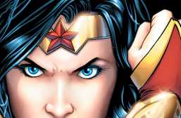
That cover is preaching me to throw some money at it.
I enjoy most ‘good girl’ art and this book is worth it as it vol 1.
What is ‘good girl’ art books?
The phrase is generally thought to come from the larger “He draws good girls” and refers to any of the fun and sexy artists since the early days. In the Golden Age there was Margaret Brundage, Matt Baker and several others. More recent artist in this vein are Dave Stevens and Adam Hughes. Outside of comics Gil Elvgren is one of the most popular from the 50’s and Olivia or Boris Vallejo & Julie Bell are good modern examples. There are several sites to search them out if you like.
Im hearing ya!
I’m terribly sorry, but the irony is that the title of this article suffers from the same complaints that you have of the cover of the Cho book that you are reviewing here, in that both seem a bit too fan-service-y.
This felt like clickbait.