The Use of Animation to Convey Character Traits
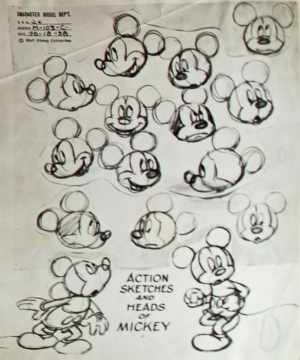
As a visual medium, animation’s top priority is to convey a world where characters exist within its own creation. Yet at the same time, this created world needs structure for the characters that inhabit its space.
Specifically the main characters are the focus of the animated world’s story. Even in the cruder worlds of the early Mickey Mouse shorts, animation still has to have a character connect with the audience by giving them familiar actions and traits, regardless of the technology itself.
Details in their animation have continued being necessary then for a main character to win over an audience, the way an early character like Mickey won over his. But different animation studios have their own approaches towards giving characters a sense of real-world personality.
Thus realism in main characters is crucial to animation studios like DreamWorks, Disney, and Warner Bros. and their separate choices of main characters: whether male, female, or animal (as seen here first in Mickey).
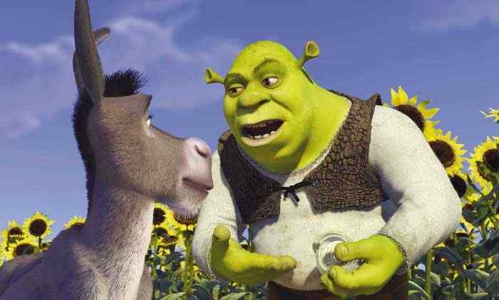
DreamWorks’ Shrek
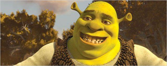
Whether The Prince of Egypt or The Road to El Dorado, DreamWorks’ animated films tend to have male main characters. In the case of DreamWorks’ first financial success Shrek, it’s no different for the title character. Made in 2001, Shrek was from the start a very anti-Disney film (no surprise since DreamWorks’ founder Jeffrey Katzenberg had left Disney).
In Shrek‘s case, it had a fairy-tale theme in CGI and not the recognized 2D and an ogre of all things play the lead. The creative team behind the film even researched “the original designs for all the fairy-tale creatures 1” to turn the “fairy-tale” on its head.
Instead of relying on mainly the character’s appearance from the 1990 picture book by William Steig that DreamWorks’ film is loosely based upon, other elements changed for the type of male lead character that the directors were going for. In fact, it took designers “over 50 different sculpts for Shrek before they decided on his final look” which was “ugly and appealing at the same time.”
Though the Shrek from the book was also green and ugly, the orange hair in the book got removed for the Shrek film to emphasize how inhuman Shrek is to everyone else and why he lives alone in a swamp.
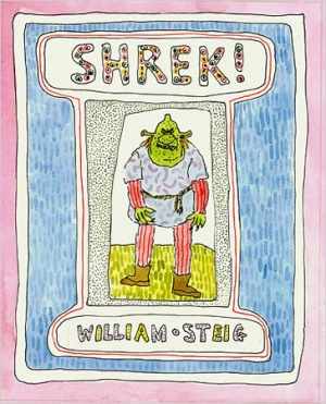
The clothing colors given to Shrek are also different from the more colorful book character since they’re in dull earthy tones for Shrek’s lack of cleanliness. The only bright color found on the film character is his acid green skin. In addition, a “leather vest” became part of Shrek’s look, symbolizing the rough edges of his personality and defensiveness towards others.
Lastly, while Shrek carries a big presence in his frame, there is a roundness to his body as well (complete with a pot-belly) to illustrate in its own way on-screen that Shrek is a sympathetic main character and not a threatening monster despite his size.
As for Shrek’s body language, there are many moments within his film that capture his personality from the way he moves to the way he twists his face around to form expressions. The fact that Shrek digs out ear-wax on-screen to use as a candle or scratches his butt reveals how unashamed he is of his personal habits on display for an invisible audience to witness.
Despite being mainly as gross-out humor in Shrek‘s context, it also reinforces the idea that the character of Shrek, though in the form of an ogre, does the same things that a normal human being would do, even if they may include using the toilet or passing gas at random points.
On a more serious note, Shrek’s gruff personality comes through starting with the way he walks which is lumbering yet imposing. Shrek is closer to the comic straight-man than his sidekick companion Donkey since Shrek only behaves foolishly when sarcastic. It’s with that quality that reveals how when it comes to more emotional matters that mean something to Shrek, he doesn’t choose to outwardly express the depth of his loneliness and that there is more to him than just potty humor.
Though Shrek was one of the earliest animated films in CGI, that didn’t affect the range of emotion for Shrek. With “180 animation controls” for Shrek’s face, he was able to “act” through the capabilities of computer animation available.
As a result, Shrek endures as the first CGI film with a fairy-tale theme. In contrast, it wasn’t until 2010 that Disney released their own CGI fairy-tale Tangled.
Inadvertently or otherwise, Tangled ended up following Shrek‘s footsteps with Tangled‘s own main character Rapunzel being a twist on fairy-tales in both story and character (down to using a similar theme of isolation for Rapunzel).
All this reflects back to Shrek‘s legacy for becoming DreamWorks’ first major box office success/franchise and that they succeeded in getting an audience to watch and connect to an ogre for three sequels.
Disney’s Belle
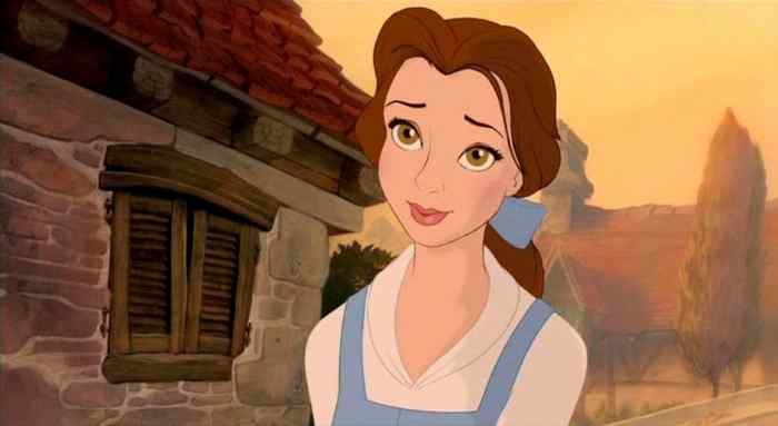
After the success of The Little Mermaid from 1989 on-wards, Disney has been on the receiving end of criticism towards the main character Ariel being too flighty and unbelievable in how she acted as part of her film’s story. In response to these criticisms, Disney set about to develop a more realistic female character who took responsibility for herself and had more subtlety in terms of appearance and action. Enter Belle, the main character of the 1991 Disney classic Beauty and the Beast.
For this latest heroine to come out of Disney’s animation workshop, a degree of creative control was given to Linda Woolverton, Beauty and the Beast’s scriptwriter (as well as Disney’s first female writer for a screenplay) to confirm there would be a real female influence behind the character’s creation. In fact, Disney went as far as to assure Woolverton that “the same accusations leveled against Mermaid (like Ariel forsaking her family and heritage for a man) wouldn’t happen with Beauty and the Beast 2.”
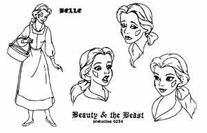
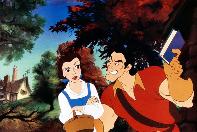
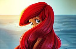
Ironically though, much in the same way as Shrek tried to go against the stereotype of a handsome hero, Disney followed a similar plan for Belle. When it comes to Belle’s appearance, one of the key differences between her and Disney’s past heroines is hair-color. Unlike the exotic hues of strawberry/golden blonde like Cinderella/Aurora or redhead like Ariel, Belle has been (to this day) the only Disney heroine to have brown hair.
Such common colors weren’t the only first for Disney in Belle; early on, when writing the script, Woolverton specifically wrote that Belle should have “a little wisp of hair that keeps falling in her face” so that Belle literally wouldn’t be so perfect that she’d have every hair in place on-screen like Ariel’s effortless cloud of red hair underwater.
Furthermore, after Woolverton joined the crew, it was the script itself that determined how the animators would portray Belle as a character from sketch to celluloid. The clothes Belle wears follow the same pattern; while Belle wears several outfits during her film, the first blue dress was the most crucial to establishing Belle’s personality at first sight with the blue indicating uniqueness among the earthy-hued townsfolk and the apron for Belle’s practicality (which couples with her ponytail).
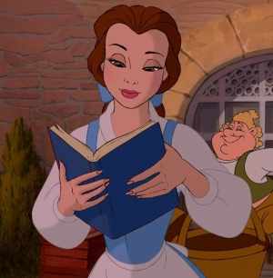
Nonetheless, however closer to an ordinary woman Belle is, there is still idealization for how she moves. In songs such as “Belle” and its reprise, she runs over open plains in long-shots and twirls to the tune as other Disney heroines.
Only outside those obligatory songs for Disney films, Belle shows how different she is in ironically her realism. Once again, Belle’s habit of brushing her hair out of her face reminds the audience that she’s human.
That’s why getting Belle’s humanity across challenged Woolverton and the rest of the male creative team since the latter went from one “extreme” of a domestic Belle baking a cake for her father and “crying too much in the Beast’s castle” to going as far as Belle locking Gaston in a closet instead of tricking him out the door in the film as was suggested by Woolverton.
It was also Woolverton’s advice that Belle’s interests as a bookworm are her main interests which wouldn’t allow for baking since being more invested in intellect, “Belle wouldn’t know how to bake,” especially since Belle complains about the mundane life in her village.
Consequently, Belle’s actions needed to back up her words as the “strong woman” Woolverton mentioned early on who could stand up to the Beast without crying more than necessary.
Given the opposing views of a mostly male crew versus the one female writer working on Beauty and the Beast, creating Belle as a person in animation was a special task in and of itself. For a company such as Disney who uses female characters so often in their films, Belle represented a break in tradition by her very existence.
No longer was a heroine for Disney animated as unique in a special coloring to her design, a special talent that emphasizes in-story beauty like singing, or connections towards her love interest. No longer was a Disney heroine animated primarily as an expected female figurehead for a fairy-tale.
To the contrary with Belle, her uniqueness is in the everyday charm of hair type and family values towards her father that can be applied for a large audience. It was Beauty and the Beast‘s reverse approach with Belle, emphasizing familiarity in her animation while at the same time having her be an outcast for those traits common to the modern world that cement how successful an animated character she was to help get Disney their first Best Picture Academy Award nomination for her film Beauty and the Beast.
Warner Bros.’ Daffy Duck
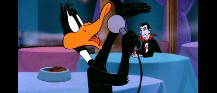
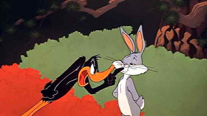
The character of Daffy Duck from Warner Bros. is too an interesting case for a main character in his own right as an animal because of how he provides a balance to the more popular character of Bugs Bunny. While Bugs Bunny is “the character we wish to be,” it’s Daffy Duck who represents “who we really are 3.”
Therefore, it’s all the more necessary for Daffy’s character to shine through in his animation. Especially since Daffy’s not human but instead, a cartoon duck who’s been assigned human characteristics.
However, within the realms of animation as a studio like Warner Bros. would know well with its other cartoon creations, a character such as a duck gets granted the traits necessary for arms that would normally be wings and bite to a mouth that would normally exist as a toothless beak. For Daffy requires large gestures and a snappy temper as part of being a loud, sarcastic anti-hero.
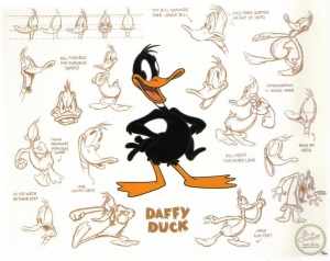
Even Daffy Duck’s overall design isn’t that colorful since his feathers are black and his beak and feet are yellow, colors that wouldn’t be too unusual for a duck. The color black contrasts the loudness of Daffy as much as it ties him back to being a common animal.
What makes Daffy stand apart from the ducks found outside his own animated world is how his eyes are bigger than those of the average duck.
As a result, Daffy’s eyes highlight how expressive Daffy is and how he never hides his emotions which leads to the audience sympathizing with him when things don’t go his way, no matter if he caused failure to happen to himself because of his character flaws.
No matter his arrogance or greed, Daffy’s bigger than life eyes clue the audience in that Daffy is a main character who goes beyond being another duck and more like another human being.
However, regardless of Daffy Duck being animated to use his wings like human hands, there are other details to the character which are like the duck under the anthropomorphism that Daffy can fall into. One detail of note is the way Daffy watches the world around him. Much like a real-life duck or animal, Daffy is always “unsure of what’s going to happen next.” Daffy often has “his arms behind him” while he “moves away from something,” revealing that animal caution of trying to detect a suspected danger for the sake of survival.
Likewise, Daffy’s webbed feet cause him to have a waddle that while being part of his species, also adds to how Daffy could fly off (no pun intended) into a tangent since he is never fully committed to the straight and narrow path. Just having Daffy’s basic motion of walking be unpredictable for the sake of being able to change his direction is telling of the character wanting to get ready for the best possible outcome: a trait common to most people, even if it may never admitted aloud out of wanting to seem in control.
This need for control is what ultimately separates a character like Daffy from Bugs Bunny. With Bugs, “confidence…shows on everything in his body” in contrast to Daffy who’s shown “having very little” to the point where Daffy could never hope to get the better of Bugs (conveyed to a “t” in the 1951 short film Rabbit Fire).
What’s more, Daffy possesses the limitations of his animal body: how loud he can raise his voice, how grand his reactions can get despite the world of Looney Toons favoring that Bugs succeeds and Daffy loses.
Therefore, the fact that Daffy fails to ever get what he sets out to do is a major reason the human audience connects to his character who is a realization” of where the audience is in their current circumstances as opposed to the ideal of Bugs who’s never depicted as struggling against fate and always has a quick comeback or seamless escape into the next frame.
That’s why it’s no surprise that Daffy has become successful as an animated character; though being introduced from a sketch, the way he “acts” in his world allows a means for an audience to know how open he is, trying to hide his insecurity no matter how obvious it is to everyone watching him.
Animation’s Contribution to Directing Characters
Over these past two centuries, animation has steadily gotten more in-tune with the naturalism of its characters using a stylistic world. Though ogres like Shrek do not exist and neither do talking ducks like Daffy, their creators’ DreamWorks and Warner Bros. bring them feasibility through the linear ways in which both interact through their designated environment whether it’s CGI or 2D.
Feasibility includes the usually fanciful Disney style with Belle because she’s a down-to-earth character as well by her animation which had aimed for the directness of an average person first (and not a fairy-tale/Disney standard) beyond mere drawings.
Hence, the same idea could be said of all three characters. No matter the company they originated from, Shrek, Belle, and Daffy ultimately began “life” as concepts “hired” in their creators’ minds before debuting their personalities across a screen and charming audiences as though they might just pop off the screen from how familiar they are through movement or design.
Works Cited
- Shrek: Production Information. Cinema.com. http://cinema.com/articles/463/shrek-production-information.phtml ↩
- Sampson, Wade. Linda Woolverton and Belle. MousePlanet, 2008. http://www.mouseplanet.com/8500/Linda_Woolverton_and_Belle ↩
- Jones, Chuck. Chuck Jones and Daffy Duck. ChuckRedux, 2011. https://www.youtube.com/watch?v=X36P4KSy7ho ↩
What do you think? Leave a comment.
They’re great at animating a character using theatrical techniques for expressing emotions and constraining it within animation rules.
People are no more like their entertainment.
Fantastic article!
Great article! It’s interesting to see how much time and effort goes into a character’s design.
Really good article which succeeds in showing in details how the work of animators on character design is essential to our understanding and appreciation of these characters. We understand their motivations, their personalities and their attitudes towards life through the way they move, they dress or the colour scheme they are associated with. These aesthetical details are essential in character development!
These are some great examples. I think that using Shrek as your primary character really hits home what you are trying to say. There are few more expressive characters than him both through animation and voice. Nice work
The Uncanny Valley has been crossed.
What a comfort to discover someone who genuinely knows what they are discussing over the internet.
Realism in animation is incredibly convoluted.
It’s best dialing further back from visual realism in order to have characters that behave realistically in a more human sense.
Really nice read. One requirement is believability. If executed well, it can create magic.
This research is interesting. While they’re at the topic of characters in animation, could they stop putting that damn smug look on the faces of all their characters, female, male and animal? One raised eyebrow, a sideways smirk, it’s just horrid.
Good point there. Maybe the “smug look” that’s so commonplace for main characters in western animation is to create a so-called “relatable” attitude to connect with a younger audience? That it’s an attempt to make the characters look confident when it just ends up coming across as “smug” (especially in DreamWorks’ case from their most of 2000s films after Shrek) like you mentioned? Either way, this trend towards main character smugness in western animation is definitely a problem…
I do hate this in cartoons. Lack of personality or aim to engage the viewer on the level of a 3 yro. Aiming too low.
Emotions are abstract, so I think animation as an abstract form, speaks to them perhaps more fluently – or at least differently- than live-action films.
I was recently speaking with a friend who’s PhD research focuses on musicality in animation. I was struck by something she mentioned: the first thing that most animators design per character is their walk. Movement is key to personality, especially when paired with an often-present score. I would be interested to hear what this author has to say about the physical mannerisms, canter, and dancing that many of the above characters display. Like Daffy’s waddling, this ties in neatly with personality-building through design choice.
Interesting fact: Shrek was to be voiced by Chris Farley originally. In fact Farley had recorded around 80% of the dialogue for the film before he passed away. Of course then they brought in Mike Myers.
The true success of a character, whether in film or prose, depends on how well the audience can identify with that character. Shrek, Belle, and Daffy are all odd or outcasts because they don’t follow the traditional model of what a hero/heroine is and how he or she interacts with the world.
How many of us can really identify with Cinderella and her fairy godmother or Ariel who wins the heart of her prince simply because of how well she sings? We want to be Ariel and Cinderella, but we know deep down we never will be, We can, however, identify with Shrek and Belle who win their respective prince/princess because of who they are, not because of magical intervention or love at first sight, and we can see in them pieces of ourselves.
While Daffy isn’t a hero, acting as more of a foil for the more popular Bugs, we identify with Daffy because we see in him things that we recognize in ourselves: anger, jealousy, and the overwhelming desire to best a rival who always wins. Daffy also stays true to himself, and even though he never “wins,” he also never gives up.
That their character traits are conveyed by simple actions–Shrek’s walk, Belle’s constant struggle with her hair, the expressiveness of Daffy’s eyes–emphasizes that the little details are the ones that are the most important and what make a character truly real.
Well written. An interesting smattering of characters to analyze.
Classical animation have been suggested as “expert” fields in understanding the expression of emotions through the body.
Interesting subject and study.
My first impression prior to reading is to wonder if there would be any other variables besides the realism of images that could have influence.
Great piece.
We can get attached to anyone character really if the story is right.
As animated characters approach visual perfection, it’s really important to display realistic behaviour in order to preserve the credibility of the experience.
How interesting. It seems that, like myself, you favor the idea of visual storytelling and world building with “show, don’t tell”. One often forgets how much color plays into animation – we associate more with Fiona than Shrek because of Fiona’s more vibrant color set. Similarly, we are repulsed by Gaston not only due to his behavior but also due to his favoring the color red, a factor often held synonymous with Danger in the human psyche.
Beautifully written. Full marks.
Great article! It’s really interesting to think about the efforts animators go through to humanize animated animals. A lot of the time efforts to make animals seem human (or like other animals, as with the horse in Tangled) aren’t very subtle at all, but I guess in some cases – like with Daffy – the animators really make an effort to characterize their designs without making it obvious.
Animators focus on features/characteristics that are prominent and often exaggerate them.
Interesting stuff. Would you expect to find a similar “Uncanny Valley” for nonhuman species, like animated cats and dogs?
They still can’t get human movement right.
Good article. I think it’s interesting to note that as the capability of animators to use computer tools to fine tune character development has evolved, so has the perception of audiences evolved and we/they expect much more from any new character introduced.
A good part of the “art” of the animator is those familiar human actions we all unconsciously do, and mostly see in others rather than ourselves. Being able to convey that in a constructed character is key to the audience’s acceptance.
I think one of the great things about animation as a medium is the possibility of creating a completely unique character in terms of appearance, which I find is limited within live-action. While you can accomplish a lot with costumes and make-up, at the end of the day your live-action character is going to somewhat resemble all the other ones played by the same actor. In animation, you not only have the complete creative freedom of making your characters look any way you like, but also making them look completely unique. This uniqueness is also a great way of creating a trademark, which so many character designs have become over the years.
I’ve never bought into the “the character needs to look like me so I can identify with him/her” thing.
This is the key to my freedom
This article has good examples and good point. I agree that these character are design to help the audience connect with the characters.
You have some very interesting information in this article. I had no idea that Belle was essentially the product of the criticism of Ariel.
Great article. It highlights why animation is a great benefit to film and television.
Much like Caliburnus, I did not realize Belle’s character was influenced by the criticisms of Ariel, though I disagree with these criticisms. It seems that Ariel’s criticisms stem from her naivety (interpreted as “flighty”) and willingness to give up family and friends for a man, but I think it takes introspection, courage, strength, and independence to know oneself well enough to choose to give up family and friends for a different life, regardless of the catalyst.
Animation is reaching a point where animated characters are becoming realistic.
Random thought: I would love to read a similar article targeted at felt creatures like The Muppets!
Great job with this! I really enjoyed how in depth you were with these characters and how you picked a part each individual character trait. There were some things about these characters that I, myself, didn’t even know!
This is a great article. You provide detail and strong description. I also believe that the relatability and emotions that a character evoke have a lot to do with it. It is all about making a character as realistic as possible, as you’ve described. A character with the right combination of relatable human traits and fantastical story can bring a lasting quality.
This was an interesting read. It is definitely interesting how animators are able to make animals have human emotions, and therefore have them be relatable.
Yeah great article, I don’t think that animation is moving towards more realistic movement. We have motion capture for that and in fact we’ve had plenty of CG films with full motion that have completely flopped.
Working in an animation studio all I hear every day from the animation director is “simplify that movement, it looks too realistic”, so what’s funny is that people are finding it easier to animate from realism. This probably comes as a side effect of filming live action tests.
I wonder what you make of the fact that in Western animation, historically speaking, male characters were often allowed to be anything from monsters to animals but female characters were more often designed as human and pretty?
This is far more technical and analytical than I initially expected, and far more exploitative of the subtle details that allow these characters’ personalities to be made clear entirely through visuals alone.
It almost seems too good to be true some of the things you’ve explained about Daffy in particular, with his waddling walk symbolizing his character’s tendency to never stay on the straight and narrow, capable of switching physical and emotional directions at any given moment. It’s incredibly genius.
Thank you so much for writing this.
This is a good article, and the analysis on Daffy has me thinking about the character’s later years. In the films produced by DePatie-Freleng, Format Films, and Warner Bros-Seven Arts, Daffy’s eyes are smaller. The smaller size corresponds to his weaker characterization while antagonizing Speedy Gonzales.
Great analysis on the in-depth work animators do to make all the little details work. It’s impressive the amount of subtlety that goes into showing characters’ emotions.
You did a great job analyzing the characteristics of the characters, its really detailed.
colour*