Michael Manning’s Paintings: A New Mythology
What is the condition of painting today? Where are the bold, visionary gestural painters?
When I ask these questions I suppose I’m speaking from a mid-twentieth century bias. At some level, I want to see the painter’s hand at work within the canvas. I want to see more of the idiosyncratic rhythms and movement of Joan Mitchell, or the mellow atmospheric heft of Mark Rothko.
This isn’t one of those “What ever happened to American painting after Abstract Expressionism” laments. That movement, for all its cerebral foment and subsequent fame, was highly specific to its time and place in postwar New York. With the Second World War, many felt that they had experienced or witnessed destruction on an unprecedented scale. The issue facing the artist-intellectual of the late 40s was how to make sense of the loss of life in the European and Pacific theaters of war, the Holocaust, and the bombings of Hiroshima and Nagasaki. Some of that is palpable in paintings like Willem de Kooning’s Excavation (1950), which alludes to the horror of mass graves in concentration camps, and Mark Rothko’s Personage Two (1946), that references the haze of destruction from both Allied and Nazi bombings. In this struggle to articulate the anxieties of the mid twentieth century consciousness, the Abstract Expressionists gave us new modes of representation that have been modified and re-appropriated among artists all over the world. It’s interesting, too, that this type of abstract painting, expansive and with a detailed focus on color and line, tends to have a broad corporate appeal. I suppose what’s easy on the eye looks good in a large room: a large sensuously appealing gestural triptych à la de Kooning’s or Joan Mitchell looks great in any lobby or conference room. But that’s only a small part of a larger question about the possibilities and outcomes of painting.
I often wonder what it was like for critics and scholars when they were on the verge of discovering something exciting within the contemporary. What was it like for Michael Fried when he first came across Morris Louis’ soak-stain canvases—I mean, beyond what we already know from his lyrical accounts? Or what inspired Barbara Rose’s particular selection of artists for her famous show, American Painting: The Eighties, for NYU’s Grey Gallery in 1979, which included Elaine Lustig, Richard Hennessy and Louisa Chase, among others. In a review of the show for New York Magazine in 1979, the poet and art critic John Ashbery, though praising the show’s boldness and imagination, called Rose’s selection of artists “an arbitrary canonization.” In talking about the great Abstract Expressionists and their unshakeable enduring influence, Ashbery quoted Auden: “The mouse you banished yesterday/Is an enraged rhinoceros today.”
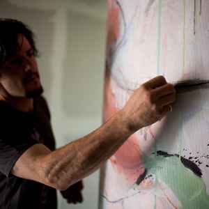
In trying to find the best among the abstract painters in America now, I’ve stumbled across the work of Michael Manning. The vast majority of people won’t know much about this forty-something abstract painter based out of New York and Connecticut, I certainly didn’t, but I believe there’s something there in his work that is quite rare and singular, something that I see in the works of artists like Joan Mitchell and Nancy Graves, something that falls into that sense of cohesive creative unity that you see only among exceptional painters.
The first Michael Manning paintings I came across were his pastel series from 2013 that were featured in Art Basel Miami, White Flag and Head Over Feet. I can the hear the voice of some critics, going off in my head, dismissing them as smooth, sensuously appealing hotel art. It’s true, they’re easy on the eyes, but there’s much more to them than that.
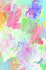
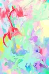
Take a painting like White Flag, a de Kooning-esque work done in acrylics. The water-based quality of acrylics enables the paint to take on the look of watercolor or gouache so that the pastels have a floaty quality of the airy smeared and scumbled de Koonings of the late 1950s and early 60s.
Bright sea foam greens transition into creamy lilacs that blur into rosy pinks and lime greens and lemon sherbet yellows. At a cursory superficial level, it can seem like a supersized version of colors from a Lily Pulitzer print, but there’s an overall sense of continuity, skill, and seamless interweaving of pigment and line that reminds one of the best of Joan Mitchell. Head Over Feet gets you with its bright squiggle-sliver of red in the corner, like a scorpion on a valentine.
From these pastel series, one realizes that Michael Manning is one of those rare contemporary painters, like Cecily Brown and Peter Doig, who understands the precise qualities of his medium and its vast possibilities.
His more recent work veers into the figurative with a new set of energies and ideas that focus on the mythic. Gone are the smooth pastel squiggles from a year ago. In Manning’s new set of paintings we see a stricken Jonah trapped in the heaving belly of the whale, flanked by other helpless shipwrecked people in a Basquiat-like swirl of reds and blues and chartreuse. There’s the angel Gabriel, radiant in a white silhouette, flanked by female attendants, that reminds one of Klimt’s Beethoven frieze in Vienna.
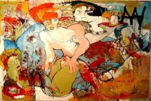
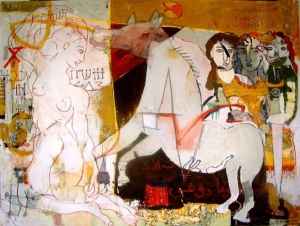
Then there’s some extraordinary paintings of horses that seem like a cross between Caravaggio and Pat Steir.
The turn towards depicting the “mythic” isn’t necessarily new for Manning, but rather something that has been simmering in his creative cauldron for a long time:
“Throughout my life I have been attracted to the stories in mythology and religion, and this has been expressed in much of my work. At an early age I questioned the meaning and purpose behind these stories and the messages they were imparting. My paintings began to use stories within mythology, along with my perspective of right and wrong, as a framework for addressing current issues faced by society. With the use of traditional mythology as a foundation, I see the new work as a kind of new mythology — new stories commenting on current issues. These stories have been constructed from my individual point of view, but reflect universal significance and meaning.”
The need for a “new mythology” is a salient point. Every artist tries to articulate the present condition of his or her world through a unique language. Myths and stories provide us with the template to find that language. I think it’s refreshing to hear a painter talk this way. It’s easy to feel jaded about the art we see now, where mass-produced workshop pieces of quasi-Pop Art are auctioned off for millions to anonymous collectors. At times one feels that the art people seem to care about the most is the art that makes news. What drew me to Manning’s work was his focus on detailed craftsmanship and his commitment to search for something larger and timeless within his work. Fundamentally, he’s a great painter, like the handful of other great painters out there now, like Cecily Brown and Peter Doig, who have that rare gift for understanding how the eye responds to color and depth and how it wanders over the surface of a canvas.
This reminds me a little of how Mark Rothko described his color field paintings, the blocks of “hovering” color as part of something “tragic and timeless” in an eternal existential drama of life and death. Recall Jackson Pollock’s Pashiphae (1947) or Mark Rothko’s The Sacrifice of Iphegenia (1942), which both use myth and folklore as a way of coming to terms with their current condition in postwar America. What could Manning be trying to contend with? The anxiety of collective global tensions after 9/11? U.S. military involvement in Iraq and Afghanistan? The global financial meltdown? The burst of the housing bubble and large-scale unemployment? The anxieties of mass surveillance and the end of privacy? It’s hard to know. What we do know is that Manning’s work, and his comments, address a timeless need within the visual arts, particularly within painting, to search for an individual language to articulate the universal.
What do you think? Leave a comment.


This is some inspirational art here.
Thanks, Chae. I’m glad to hear that you liked this.
Great analysis. I like your connections to other artists. I think there may be more to that working in Manning’s work. For me, I feel the work to be a bit stale, maybe to derivative. The color palettes of the 2 series you highlighted here feel arbitrary to me. On his site his Gilgamesh series feels like the most complete body of work he has.
Again, love your research and breakdown of his work.
Hi, Jamie. Thanks for your kind words. I’m glad you looked at Michael Manning’s other paintings on his website which helps to give you a sense of his body of work. This article would have gone on forever if I talked about all his series of paintings, so I chose only two. I agree with you on the “Gilgamesh” series. I like it too. It’s rich, nuanced, and boldly orchestrated in way that reminds me of Basquiat’s work at times.
Though I think with “All the Pretty Horses” and “The New York Series” he made a conscious, deliberate decision to scale down and limit his color palette. As you’ll notice, he structures the “Horses” series around mostly cooler colors, while with the “New York” series he does so with warmer colors. The colors, which may seem a bit monotonous or “derivative,” as you say, are intentionally honed down to focus on larger thematic concerns.
“Gabriel and the Devil Woman” is stunning.
Thanks, Kincaid. I really liked that one, too.
I think that’s my favorite too.
Love the colours in ‘Head over Feet’ and ‘White Flag’ – great analysis!
Thank you, Jessica. I’m glad you liked the essay.
Your inclusion of the mythic function of art is an interesting point, yet you don’t seem to push it far enough – at the end instead you back step into the political: “What could Manning be trying to contend with? The anxiety of collective global tensions after 9/11? U.S. military involvement in Iraq and Afghanistan? The global financial meltdown? The burst of the housing bubble and large-scale unemployment? The anxieties of mass surveillance and the end of privacy?” Is Manning being loose with his use of mythic? For when you quote his comment about new mythology it appears as political art rather than mythic.
Hi Maltese, thanks for taking the time to read this essay and to address your thoughts in this comments section. As you’ll recall from the passage I quoted from Michael Manning as he talks about his use of mythology, he says, “With the use of traditional mythology as a foundation, I see the new work as a kind of new mythology — new stories commenting on current issues.”
“New stories commenting on current issues.” My aim towards the end of this essay was to leave the associations between the use of myth by artists and their attempt to come to an understanding our current condition in the open-ended. You’re right. I didn’t push it far enough because I didn’t want to. I think the points you bring up are useful to consider from our own individual perspectives. Myths and folklore provide artists with a set of stories and principles with how we can make sense of history, but what then? Certainly something to think about.
Could you expand on what you mean by useful from our own individual perspectives?
I’m trying to make sense of his use of ‘new’- considering that one of his paintings is titled “Jonah and the Belly of the Whale.” Is it the formal expression that is new, as it is situated in a different historical time? Are these new stories just his images thematic references to the past, but in an expressionist manner?
Maltese, I think when you think about it carefully, you’ve probably just answered your own questions. What you’re asking it seems, is your way of coming to terms with what your finding interesting in Michael Manning’s work.
My intention with this essay, was to tell people about this painter, perhaps to people who hadn’t heard about his work before, and to get people thinking, which fortunately, is what seems to be happening in this comments forum, and I guess that’s probably the best explanation I can come up with for now.
I’m interested in your answers about his meaning of new mythology though. My questions were implicitly my own answers. Your psychologizing reader comments is an interesting take on my interpersonal process, but my “coming to terms” is just a question of clarity not acceptance.
I appreciate your timely responses.
These are two different painters. The paintings you have shown here are by ME, Michael Manning a 29 yr old artist living in Los Angeles. I am a different person than this other older Michael Manning. All the work from Bill Brady Gallery is by me.
http://themanningcompany.com
To Michael Manning: Thanks reaching out and clarifying this distinction. My apologizes for the mistake. I was supposed to write about an emerging painter whose work I found to be really interesting, and I liked your paintings. But found it very difficult in the beginning to find the adequate amount of information about your background and work. I didn’t come across this site from the Bill Brady Gallery’s page at all before, so thank you for putting it up here. In fact it was challenging to find the right amount of background information about you and your work at first, so I’m glad you’ve brought this website to our attention.
In any searches about “the artist Michael Manning,” as a cautionary note, the work of the Michael Manning in Los Angeles tends to come up more frequently. Your work and his both stand out as examples of painting that I really like. I’m sorry if the confusion about your identities may have offended you, but there was relatively little I could find in the beginning to clarify the distinction, so that’s why I made the mistake. But I hope whoever reads this will become more familiar with the work you’ve done and how, at least to me, it seems like a good example of what’s excellent in contemporary painting. —Farisa
So, what Michael Manning’s work are you referring to here, the older one or the younger one?