A History of Colour: The Difficult Transition from Black and White Cinematography
In Colour Consciousness, Natalie Kalmus wrote that the ‘inherent desire for artists to show motion in colour’ has always existed 1. From the first cave paintings, man has tried to illustrate his perception of the world and replicate his field of vision as accurately as possible, and film became the best form to fulfil it. But it recorded a colourless world, unlike human vision. Black-and-white cinematography dominated, and people got used to it. When colour technology was finally elaborated studios were reluctant to employ it, mainly because of its deficient quality and limited practicality, its huge cost in parallel to its little demand and its stylistic devaluation by artists. The reasons why transition to colour took over three decades can be divided into three main categories: technological, economic and aesthetic issues.

Technological problems were at the heart of the difficult adoption of colour by the film industry in the 1930s up to the 1960s. Most studios perceived the technique as defaulting and were not prepared to make the change to a process seen as tricky and unsteady. The birth of Technicolor in 1915 is remembered as a decisive event in the history of coloured films. Founded by Herbert Kalmus, it introduced film-makers to the two-colour subtractive process, where two negatives capturing red and green lights were placed back to back.
Warner Bros used it in 1929 for On With The Show! and other studios started to follow suit, but the lack of quality in release-printing and its cost halted Technicolor’s rise.
Consequently, it released a three-strip process in 1932, where two 35mm strips of black and white film negatives, one sensitive to blue and the other to red, ran together through an aperture behind a magenta filter. A separate strip allowed the green light to pass through behind a green filter. The lights were divided through a prism and refracted by mirrors through the different filters, all in a single camera.
But such an elaborate process was time-consuming. The cameras were very heavy, which limited their transportations and excluded outdoor shooting. The colour images had to be clear throughout the whole film, and one of the biggest problems when using Technicolor was to produce enough light. Keeping the lighting consistent was a complex matter as the process was slower; it needed brighter lighting, and had a narrower latitude, which means that shadows were more liable to black out and brightness to white out. The cinematographer Franz Planer said that ‘in colour, you may have an exterior sequence that […] requires three or four days to shoot the sequence. Shooting throughout the day you run into vast changes in colour and lighting’ 2. It therefore needed to be shot indoors, and used more electrical power.
The Society of Motion Picture Engineers Studio Lighting Committee reported in 1936 that average black-and-white set illumination required 250 to 400 foot-candles, whereas colour productions needed 800 to 1000 3 . On the set of 1939’s The Wizard of Oz, it has been reported that temperatures reached more than 38°C due to the high levels of illumination and some heavily costumed characters required large water intake. Some actors also complained to suffer from permanent eye damage, according to Richard. B. Jewell in The Golden Age of Cinema.
Another technical issue was the lack of compatibility between colour and other cinematic technologies – for instance, deep-focus was out of the question. The variety of camera tricks became limited as directors were more concerned about displaying a convincing colour-film and were not enough experienced to assemble complex camera work with Technicolor. Technical limitations discouraged directors to fully adopt screen colour. It complicated film-making and restrained their creativity. Yet Technicolor did open the way to colour films, and the complete transition, as hard as it was technically, did occur. Technicolor rose during the 1930s-40s, and films like Disney’s Flowers and Trees (1932), La Cucaracha (1934) or Gone With the Wind (1939) won Academy Awards.

The subtractive process was definitely more convenient than the additive one. It eliminated the need for special projection equipment. The technique was refined with a superior colour rendition, a sharper definition and a greater depth of focus. Amounts of lighting needed got diminished. Hence the clear superiority of Technicolor’s quality pushed the company at the high point of the market. But it was another firm, Kodak Eastman, who truly ameliorated colour processes and therefore generated its wider diffusion among studios.
In 1952, it introduced Eastmancolor, a one strip colour negative process or ‘monopack’, and its high quality convinced most of Hollywood’s studios. In 1954, the 3-strip Technicolor camera was used for the last time, and the company remained as we know it today, releasing prints for films shot with monopack negatives. Colour became more and more prominent as the technique became easier to handle. In addition, the film industry needed to reinvent itself in an era where consumerism and suburbia encouraged people to stay home, factors that nurtured the development of television later on. To keep its high level of audiences, the cinema had to innovate, and colour was the economic solution to the problem. But the process was expensive, and most film-makers were not ready to spend that much money on an experimental technology.
Financial issues have bridled the full expansion of colour within the film industry, and economic awareness is an important reason why colour transition was so laborious. One of the main issues was the cost of colour production – filmmakers found it too expensive and not worth spending the money if audiences were still fond of monochromes and black-and-white cinematography. Of the top grossing films for each year from 1940 to 1949, 5.5 were in black and white and 4.5 in Technicolor 4. After the transition to sound equipment, studios were not prepared to be retooled again. The cameras alone cost $30.000 to build, prints’ cost increased from $5c in 1940 to $7c in 1949 and lighting, costuming and scenery were expensive as well. Colour added about 30% to the average production costs of films in the 1930s 5, and at the time there was no pressing commercial desire to integrate colour. It only added about 25% to a film’s earning, which was not enough to cover all the expenses generated by the process. The cheaper colour technologies were neither a solution as their quality was too questionable, and Technicolor protected its monopoly over the market.
At the time, Technicolor owned the colour-film market and kept a tight control on its technology. To use colour in a film, production teams had to bend to Technicolor’s demands. The company wanted to supervise the production of colour-features to a great extent and placed restrictions on production practices. It owned 3 laboratories in New Jersey, London and Hollywood, which limited the production and diffusion of the process. It had its own staff to design special printers. Producers had to rent Technicolor cameras, use Technicolor make-up and hire Technicolor cameramen and consultants who would advise on sets and costumes. It even provided electrical and sound motors compatible to the Technicolor process. Thus the whole procedure took time and money, which discouraged most of the studios.
The Technicolor supremacy created a certain distrust as well within the cinematic world as its purposes were ruled by profit-making strategies and relied on individualist corporation methods. Other companies were slowed down in their development of colour technologies, and colour process was perceived as a way for America to dominate foreign markets. Dudley Andrew ties the expansion of colour cinematography to the historical and political turmoil in Europe in the 1940s, marked by the Second World War. The production was slowed down, but Technicolor re-established itself straight after the end of war and ‘virtually blackmailed its way into dominance in the thirties’ 6. For instance, France allowed the company to establish itself in Paris, but the tight control imposed by the firm quickly disheartened French cinema. Instead, French critics favoured the German Agfa process, which allowed outdoor shooting, captured the sunlight’s natural colours and modulated hues more subtly; but it was also a way to revolt against US hegemony over colour techniques. Technicolor’s efforts to innovate diminished as it focused on ruling the market exclusively, and the process of colour-making was hampered.
Eventually, these economic restrictions disappeared through the 1950s and colour’s commercial appeal increased. Technicolor’s empire started to fall down as other companies produced more efficient material like Eastmancolor, that could be used in a conventional camera, or Afga, that allowed outside shooting. Technicolor was dethroned due to its exclusivity, which rarefied colour processes. But the decisive reason for the film industry to fully accomplish the transition to colour was the arrival of television. Since people could now watch features at home, TV was perceived as a rival that would reduce cinema’s audiences. In order to attract spectators, cinema had to conceive new appealing visual effects to offer the viewers a different, sensational experience. Colour was its direct response as television posts could only screen black-and-white films.
The use of colour techniques rocketed for a while; 51% of all US films were shot in colour, but it dropped again to 21% in the mid-1950s as the film industry established a commercial entente with television. It sold old films to TV channels, and since it could only be shown in black-and-white, the film industry didn’t bother shooting new coloured-features, believing this contract would last for a long time. But when television itself switched to colour in the mid-1960s, it could only follow it, and the transition was completed, turning colour into a standard. Economic reasons played an essential part in the difficult adaptation to colour film; but the slow demand was nurtured by aesthetical doubts as people did not believe in the potential of screen colour.
The difficult adoption of colour partly resulted from the psychological, ideological and aesthetical impediments shared by artists, critics and audiences. In his article, David Batchelor talks about ‘chromophobia’ and states that there were various attempts made to purge and devalue colour from culture since ancient times 7. Colour was associated to the feminine, the ‘primitive’, the superficial and the vulgar; it was excluded from the higher matters of thinking and was perceived as an extreme prejudice in Western civilisation. The abjection for colour was a rooted phenomenon, and this impacted the transition to colour cinematography. Visually and stylistically, screen colour did not convince everyone. As Douglas Fairbanks stated, colour:
‘always met with overwhelming objections. Not only has the process of colour motion picture photography never been perfected, but there has been a grave doubt whether […] it could be applied, without detracting more than it added to motion picture technic. The argument has been that it would tire and distract the eye, take attention from acting, and facial expression, blur and confuse the action.’ 8
In the light of these words, we understand that people assumed colour was incompatible with film’s other practices and would therefore radically change the nature of cinema. Colour would also have an impact on human sight and health, and disrupt the audience’s vision. Screen colour was apprehended in a total different form than human natural vision, and people did not believe that film could expose colour as we see it every day. Film director John Huston said that ‘colour in nature is very different from colour on screen’ 9 as it appeared too bright and too vivid. It lacked subtlety and definition, and did not provide natural effects, but instead ‘isolated objects with an effect of verisimilitude’ and gave birth to ‘travesties, unreal compositions in which things look either too real to be credible or definitely unreal’ 10.
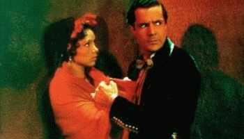
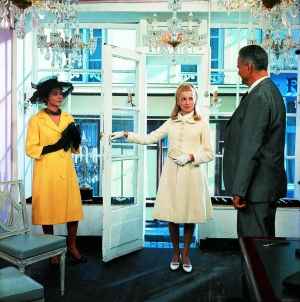
In La Cucaracha, colour is used abundantly in every possible way: in costume and make-up to convey exoticism and create contrasting relationships between the two main characters; in the background to value the set; and even in the narrative to convey certain emotions and create humour, like when Martinez’s face becomes red of anger. But the field of vision is saturated and confused.
Becky Sharp (1935) was the first Technicolor long-feature released, and most people were very critical of its use of saturated colours for costuming and neutrals in the background, juxtaposing hues that dispersed the attention and constantly pulled the eye away. Critic Don Herold wrote that the actors looked like ‘roast turkeys’. He added that ‘we don’t see colour in real life to any such extent as they give it to us in the picture’ and that they appeared ‘vivid, livid, disturbing and distracting’ 11. As Mamoulian himself -Becky Sharp’s director- said: ‘The cinema must not […] go about colour as a newly-rich. Colour should not mean gaudiness. Restraint and selectiveness are the essence of art’. So colours appeared garish and inaccurate mainly because of the aesthetical choices made by Technicolor consultants as they wanted to display their new technology, but failed to convince.
One of the most serious fear about using colour was that it would distract the viewer from important elements within a film, like the narrative or the performance. Using colour meant exploiting the set, costumes, make-up and props, therefore granting the spectator with more visual information and giving him the chance to focus on specific details. Colour was seen as distracting from the story and unsuited for intense dramas. It was commonly used in light-hearted genres like Westerns, musicals or cartoons. Black-and-white was favoured for darker dramas and was treated very distinctly from colour. The Academy Awards for example had two separate categories, one for best black-and-white film and one for best colour-feature. Even Herbert Kalmus said:
‘If a script has been conceived, planned, and written for black and white, it should not be done at all in colour. The story should be chosen and the scenario written with colour in mind from the start, so that by its use effects are obtained, moods created, beauty and personalities emphasised, and the drama enhanced.’ 12
Because colour came later, many people denied its right to exist as one separate medium, and conceived it as an addition to black-and-white. After the critical reception of bright Technicolor features, Hollywood toned down its colour scheme, and used colour only merely in ranges of grey, brown and dark blue, which created harmonious patterns but constrained colour’s potential. As Robert Edmund Jones, early Technicolor consultant, wrote: ‘Black-and-white thinking still dominates the screen […] Hollywood took hold of [colour], subdued it, “rarefied” it […] and is now trying to ignore it.’ Colour still struggled to acquire a strong position within cinematic techniques, and artists, like audiences and critics, were not adventurous enough to truly embrace colour.
Yet colour did finally break through as artists realised its creative potential and audiences demanded more realism in film’s visual effects. In The Case of Colour Film, Brian Winston writes that technological evolution is embedded in the social sphere and is a direct expression of our culture. Colour film is a cultural creation that responds to the social addiction to realism in the Bazinian sense, this necessity to mould art through our perception of reality. So on one side, film-makers worked on bringing screen image as close as possible to human vision. Natalie Kalmus states that perfection of photography tries to enhance the viewer with a more complete experience and tends towards a deeper realism, but that this ‘accurate record’ of life and reality must still be guided by the principles of art. She says that the complete exclusion of colour is not keeping with Nature and that the ‘super-abundance of colour’ is as unnatural as ‘the complete absence of colours’ 13 Thus colour has granted cinema with a new sense of naturalism which has completely discredited black-and-white cinematography from there on.
On the other hand, the transition to colour became complete when film-makers understood its creative potential beyond the realms of realism, and started treating it as a new artistic tool to empower their imagination. Colour brought to directors a number of artistic liberties to control audiences’ emotions, and some of them stepped out of naturalism to engage with colour in a fantasy way, like Jacques Demy’s The Young Girls of Rochefort or The Umbrellas of Cherbourg. A colour can mould a specific mood or carry out certain symbols and emotions; for instance, red is associated to passion, anger and danger. Natalie Kalmus explains that colours mixed with white suggests youth; with grey, it implies refinement and with black, dignity. All colours speak their own language, and it is up to the director to play with their connotations and sharpen the meaning of a film.
Colour became a viable technology and contributed meaningfully to a film’s style as directors stopped considering it as something superadded and used it to give an impulse to the drama and implicate it within the narrative. They had more control over lighting, exposure, choice of set, costumes and props, but also over the colours of an exterior scene by deciding what weather, season of the year, or time of day to shoot in. As the technology improved, they also had more control over the camera’s movement, choosing if an angle would include or exclude a particular colour in the setting, or minimize/emphasize a specific colour in the scene through long shot or close-ups. Colours also provide cues to read the face and body of actors, and forge connections between characters through costumes.

In Leave Her To Heaven (1945), Ellen’s clothing reveals her desire to control people she loves and unmask her manipulations. She always wears white, red, green and blue, and her lipstick symbolises the dangerous femme fatale. The only time she wears a different colour (the peach nightgown) is when she is pregnant and feels imprisoned by the baby growing inside her. Her sister Ruth starts to wear colours associated to Ellen, as if she slowly emancipated from her sister’s control while getting closer to Richard. Colours highlight the antagonism between the two sisters, and even if they appear plausible and naturalistic, their systematic patterning constitutes a subtle channel of expression and allegories, thus reinforcing the drama. Hence colour offered many aesthetical possibilities which encouraged its complete adoption by film-makers, who enriched their creations and gained a tighter control over film techniques.
As we have seen, the thirty years in which cinema shifted from black-and-white cinematography to screen colour were full of obstacles, but by 1960s the film industry had completely accepted colour. Scepticism disappeared as the technology became more efficient and more accessible. Prices for the colour equipment went down, and profit increased. Even more importantly, artists and critics overstepped their psychological barrier towards colour technology and learned to appreciate and praise it. As black-and-white films disappeared, film-makers started to understand that the important thing was not to use colour because they would suffer at the box-office with black-and-white, but because they simply wanted to, in order to unfold their creativity. Consequently, it gave them more freedom to enlarge their aesthetical palette and offer a greater variety of technique to the audience.
Works Cited
- Kalmus, Natalie ‘Color Consciousness’, Journal of the Society of Motion Picture Enginneers, reprinted in Dalle Vacche, Angela and Price, Brian Color: The Film Reader (New York and Abingdon: Routledge, 2006) ↩
- Basten, Fred, Glorious Technicolor (New York: A.S Barnes, 1980) ↩
- Higgins, Scott ‘Technology and Aesthetics: Technicolor cinematography and design in the late 1930s, Film History, 11:1 (1999) ↩
- Neale Steve, ‘Technicolor’- reprinted in Dalle Vacche, Angela and Price, Brian Color: The Film Reader (New York and Abingdon: Routledge, 2006) ↩
- Winston, Brian ‘The Case of Colour Film’ in Technologies of Seeing: Photography, Cinematography and Television (London: BFI, 1996) ↩
- Dudley Andrew, ‘The Post War Struggle for Colour’ in Teresa de Lauretis, Stephen Heath (eds), The Cinematic Apparatus (London: Macmillan, 1980) ↩
- Batchelor, David ‘Chromophobia’ – reprinted in Dalle Vacche, Angela and Price, Brian Color: The Film Reader (New York and Abingdon: Routledge, 2006) ↩
- Buscombe, Edward ‘Sound and Color’, Jump Cut, 17 (April 1978) pp.23-25 – reprinted in Bill Nichols (ed.), Movies and Methods: An Anthology, Vol.II (Berkeley and Los Angeles: University of California Press 1985) ↩
- Basten, Ibid ↩
- Nash, Pete, ‘The Colour Film’ in Davey Charles, Footnotes to the Film (London: Lovat Dickson, 1937) ↩
- Higgins, Ibid ↩
- Deutelbaum Marshall, ‘Costuming and the Color System of Leave Her to Heaven’, reprinted in Dalle Vacche, Angela and Price, Brian Color: The Film Reader (New York and Abingdon: Routledge, 2006) ↩
- Kalmus, Ibid ↩
What do you think? Leave a comment.


I know this is a little redundant, but color is important to film in many ways. Without it, we may of never had color symbolism, and it has become important to the character of the setting of the film.
Always curious as to films history of color. Great info, thanks and well done!
I think you we should give credit to the Disney Studio’s historical place in furthering the use of Technicolor.
So great! I’ve done some study of film, but I never learned about the history of film color photography. So thanks for that!!
Some early color Westerns look more red and green than color.
Color is like 3-D, for it to work it has to be perfect.
I like how Roger Ebert was against the attempts by Ted Turner to colorize black and white classics.
I wonder if when the colors first appeared in the movies there was “color haters”, such there is today with stereoscopic 3D. ” I hate colors, it just the movie dull and stupid.”
There actually was! Some critics were very negative about colour and their responses were quite radical.
It’s interesting how things are cyclical in cinema history.
Learnt a lot from this post.
world earliest colour film was made by edward raymond turner in 1901
How would I create a technicolor effect in today’s world?
Please check out the Timeline of Historical Film Colors:
http://zauberklang.ch/filmcolors/
for detailed information about the development of film colors. It’s illustrated with several thousand photographs of historical film prints.
I would also like to see the importance and use of broadcast colors. Specifically 16-235 vs 0-255 or what is known as Studio RGB vs Computer RGB.
You really should make a history lesson on Movie Sound because it was evolutionary like color film.
That would really also be compelling… maybe even a side by side study of the two topics. Excellent article!
Digital still can’t reproduce every color. Digital is only a facsimile. Just like a fax, it can only reproduce so much. My nephew is in the digital theater projection industry and he tells me that they are still adding colors to the digital process. Film was so much better.
A great educational article.
What an interesting piece! I cannot even begin to imagine the tedium of hand-coloring each frame in early color film back in the good days.
Any discussion of the history of Technicolor should probably include John Huston’s battles with the company over the look of the original “Moulin Rouge,” a battle to recreate in film the subtle hues of impressionism which Huston won.
Very interesting article! I love black and white films from the 30’s and 40’s, but a few of my favorites weren’t completely black and white. When The Wizard of Oz goes from B&W to Technicolor, those watching know they’re not in Kansas anymore!
Color films were rare and expensive through the 1940s.
This was interesting. Thanks for sharing.
Brilliant, thank you..
informative and useful. thanks!
Such a great article! Thank you!
I learned so much from this. Thank you for the excellent research.
One of my favorite bits of movie trivia concerns the use of color in the Wizard of Oz. The original book was a metaphor about America’s money system — Baum wanted to continue with the silver/gold standard instead of paper currency. The Emerald City and the fake “wizard” were making the point that the paper system had no real power. The yellow brick road (gold) was reliable, however. In the book, Dorothy’s shoes were silver, and were a statement about the power of the silver standard.
But because the movie was one of the first filmed in Technicolor, the director changed the color of Dorothy’s shoes to red, so they’d pop. He felt silver shoes would look “black and white” on the screen. Now hardly anyone remembers the shoes were every silver.
Very interesting to learn about the history of cineamatography, great article!!
I appreciate how in depth your research has been into this topic, and in particular it’s interesting to think about how dependent colour film (such a taken for granted thing now) was on the financial endeavours of one company! I saw the Kodak exhibit at the National Media Museum in Bradford, Yorkshire, and there were examples of the shift from black and white into colour (in photography and moving pictures). Would recommend to anyone happening to be in the area!
to have this as an assigment for class, its not that helpful
Great article! I love that you’ve given the list for ‘works cited’ for those of us who want to follow up.
Pointless observation, probably, but the concept of the two colour subtraction process, and read and green, made me think immediately of the rods and cones in the human eye. I wonder if the physics was somewhat similar, or if the structure was in any way actually inspired from the composition of the human body! Wouldn’t that be exiting :’D
Thanks for writing this, it was a great read.
Thank you for this. Very informative and well composed.
I need to know who wrote this for a school MLA and when it was published.
It is written by Rachel Elfassy Bitoun. You can find the author name at the bottom of the article.
Profile:
https://the-artifice.com/author/Racheleb
A very good essay. I remember Congress had hearings on colorizing movies (that might have been Ted Turner’s doing) that were black and white and various directors and actors appeared to challenge the process.
I recall that there have been some artistic forays into black and white even today. The Artist is a prime example thereof.